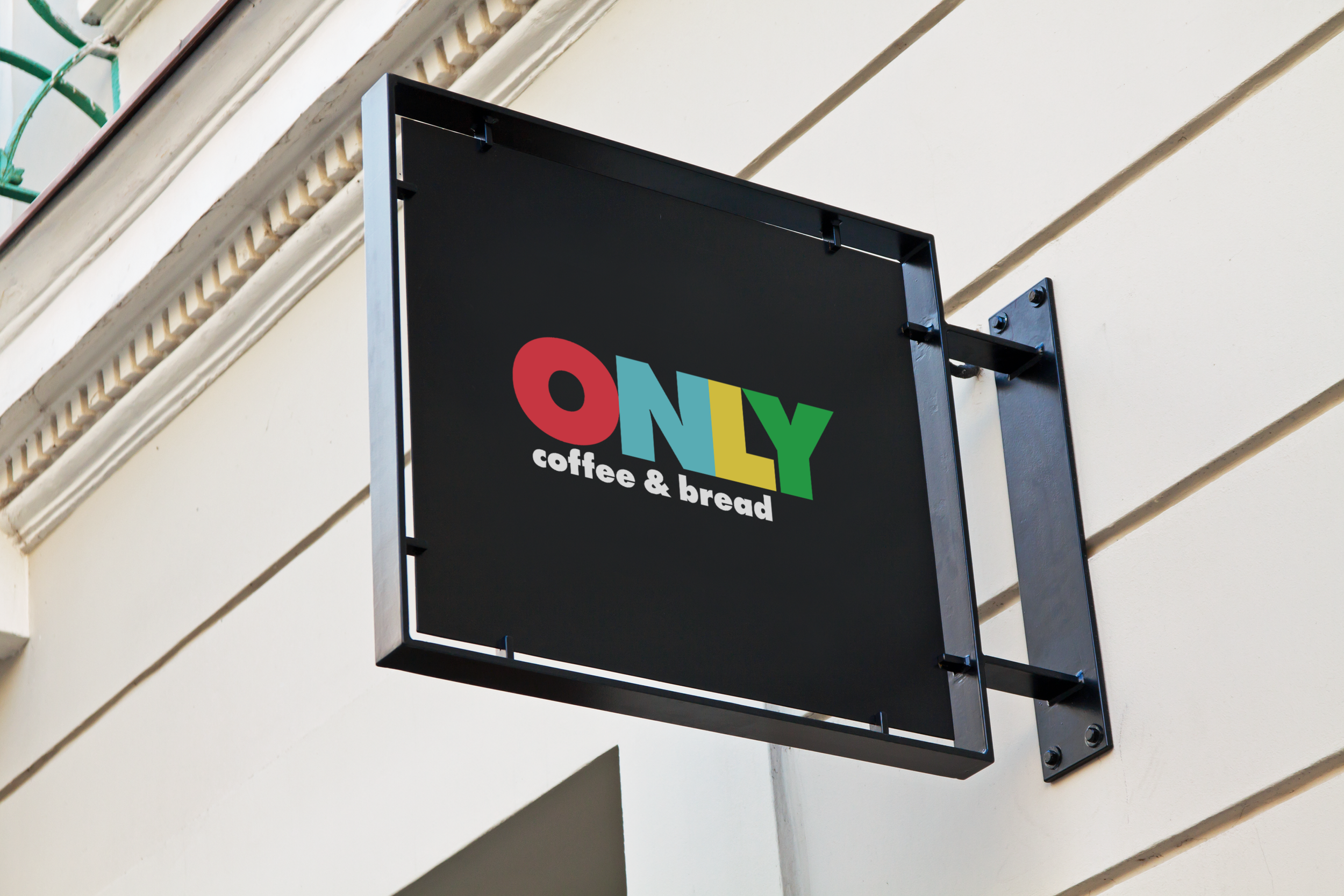
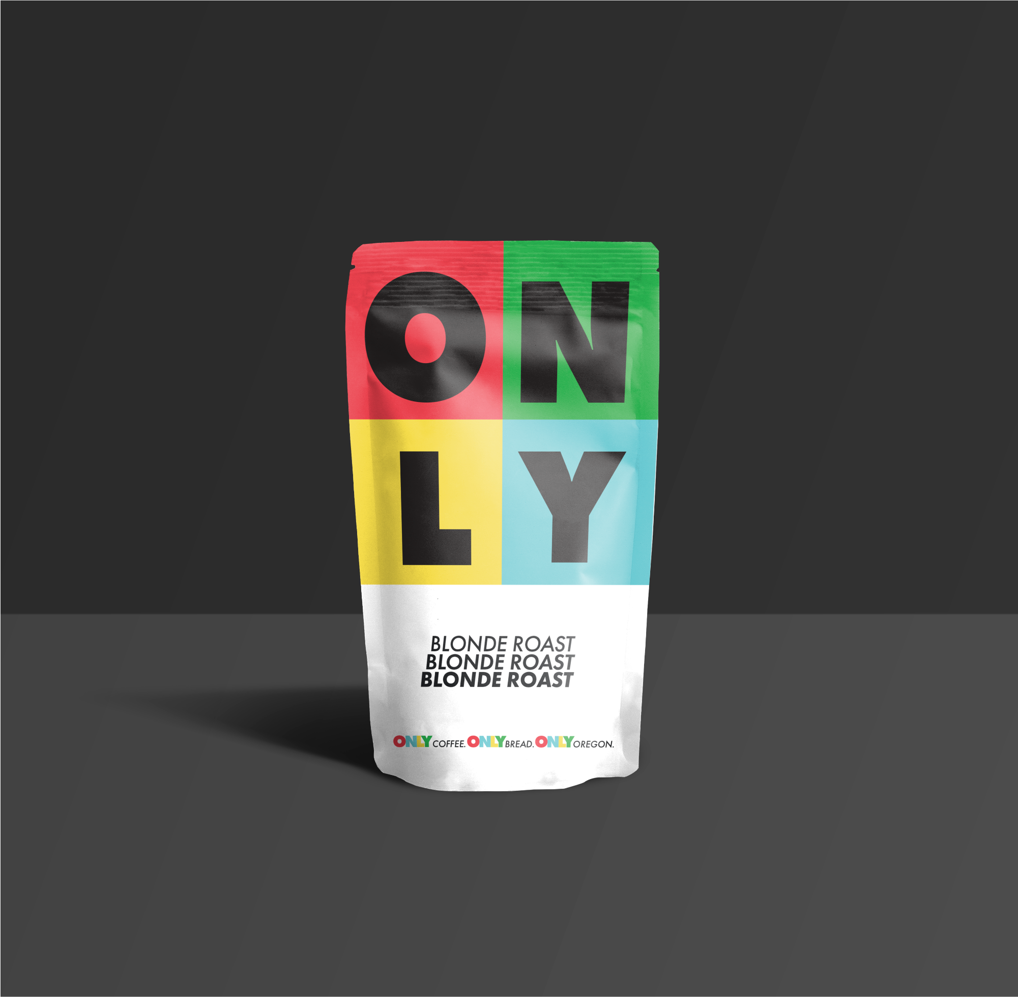
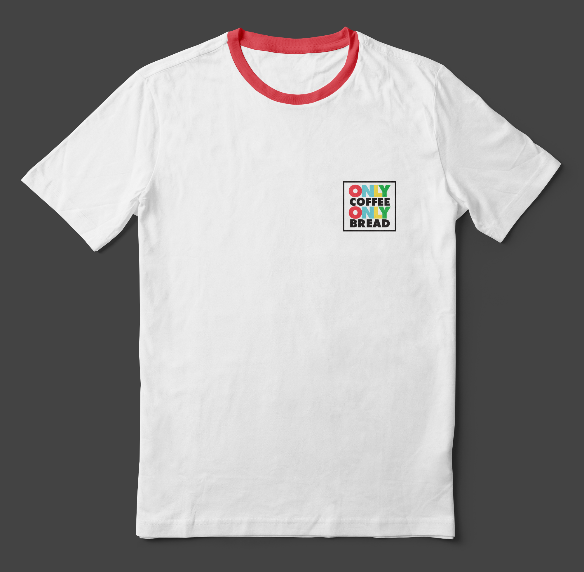
WITH ONLY COFFEE I WANTED TO BOTTLE THE ENERGY OF ESPRESSO. I wanted the brand to feel bold, playful, and impossible to ignore. Inspired by pop art and strong typography, I used REPETITIVE MANTRAS and primary colors to build a look that’s simple but full of energy. It was also a great chance to dive into signage and physical mockups.